sinead o’connor vinyl redesign
The vinyl design was inspired by Sinead’s lyricism and the meaning behind her music, my aim was to create a sentimental tribute to her and her meaningful album.
The album’s lyrics and cover are centred around themes of loss, impermanence, layers, personalisation, and reflection.
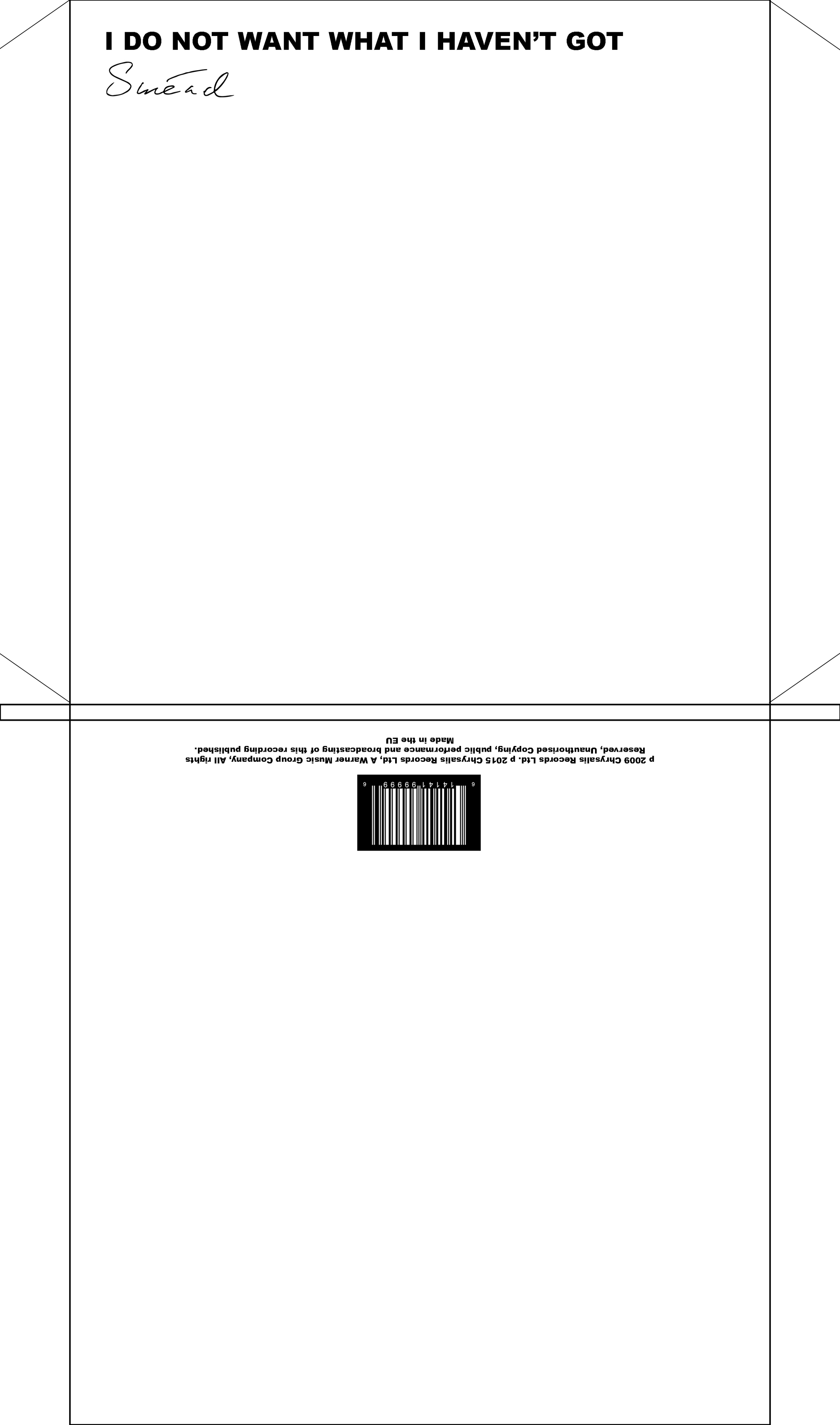
The vinyl features 10 singles made from Flexi Discs, these are old-school vinyls that were given away in magazines to advertise new and upcoming artists or music. The lack of durability of Flexi discs (only being able to be played a handful of times before they are destroyed), reflects themes of impermanence and loss. While making each listen more special, allowing users to enjoy the experience knowing they can only repeat it a finite number of times.
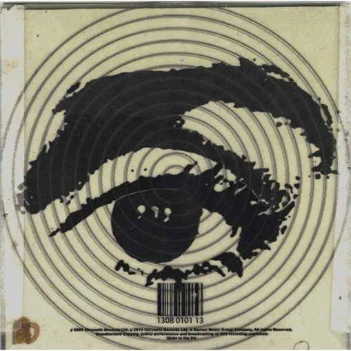
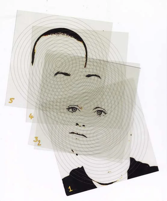
For the design of the album itself I used a headshot of Sinead on the front, and a close-up image of her eye on the back, referencing her earlier album covers and the original cover for this album. The images are stacked to convey the theme of layers, a significant theme throughout Sinead’s life and music.
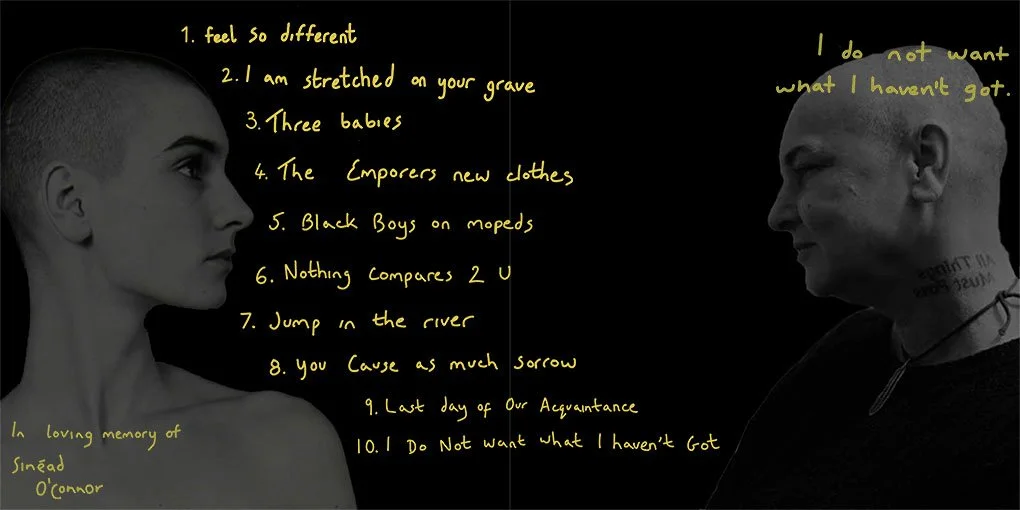
For the middle fold, I used Sinead’s handwriting to convey the personal nature of her previous album covers. Images of a young Sinead and an older Sinead looking at each other from either side of the middle fold convey the theme of reflection, the change of Sinead both physically and mentally, and her relationship with her song titles. The album, often proclaimed as a “bibliography” of her life, is sentimental and the imagery used attempts to further push the narrative that her songs have moved in tandem with her life.

mockups

individual slides

middle fold
vinyl sleeve